samedi 9 mai 2015

JEAN NOUVEL & ARCHITECTURE STUDIO - INSTITUT DU MONDE ARABE - 1987


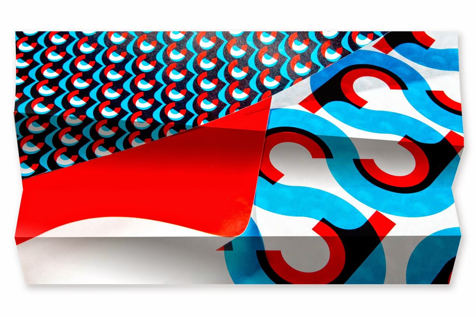
STUDIO DUMBAR - ID CHAMPALIMAUD FOUNDATION - 2004


In his will, Portuguese entrepreneur Antonio de Sommer Champalimaud bequeathed a quarter of his fortune to the founding of a charity. Dedicated to advancing biomedical research in neuroscience and oncology, the Champalimaud Foundation was subsequently established in 2004. Studio Dumbar was invited to help bring the foundation to life by creating its visual identity.
Our concept reflects the foundation’s long-term commitment to protecting the ‘circle of life’ through cutting-edge medical research. Utilizing the charity’s initials, the logo supports this theme whilst representing a hole or microscope lens, through which the human body can be observed. Tactile print processes were employed to further suggest the senses. By repeating the logo we also created an array of eye-catching patterns that recall scientific formulas and cellular structures.

HERB LUBALIN - ITC AVANT GARDE - 1970

Herb Lubalin (1918-1981) cofondateur de la International Typeface Corporation (ITC)


NEUE - LOGO DE LA PÉNIINSULE DE NORDKYN - 2011

A l’extrême nord de la Norvège , se situe la péninsule de Nordkyn dont font partis les communes de Gamvik et Lebesby. Ces dernières ont décidé de s’unir pour se doter d’une identité visuelle pour promouvoir leur région. Ils ont fait appel au studio Neue basé à Oslo.
"L’identité visuelle est basée sur deux ingrédients principaux, notre slogan, “Là où la nature impose ses règles” et les données de l’Institut météorologique norvégien. Un flux de statistiques météo affecte le logo lorsque la direction du vent ou la température changent. Sur le site, le logo se met à jour toutes les cinq minutes. Nous avons développé un générateur qui vous permet de télécharger le logo selon les conditions météo exactes d’un moment particulier. Nordkyn est vraiment un endroit où la nature impose ses règles, même sur l’identité visuelle."


STEFAN SAGMEISTER - LOGO CASA DA MUSICA - 2007

Casa da Musica Identity

This is a comprehensive identity for Casa da Musica, the Rem Kohlhaas designed music center in the harbor town of Porto in Portugal. Our initial desire to design an identity without featuring the building proofed impossible because as we studied the structure, we realized that the building itself is a logo. Kohlhaas calls this "the organization of issues of symbolism". Really. But we did try to avoid another rendering of a building by developing a system where this recognizable, unique, modern form transforms itself like a chameleon from application to application, changes from media to media where the physical building itself is the ultimate (very high-res) rendering in a long line of logos. Our goal was to show the many different kinds of music performed in one house. Depending on the music it is filled with the house changes its character and works dice-like by displaying different views and facets of music.


ERIK NITSCHE

Rapport d'activité, couverture de livre, illustrations minimaliste et géométriques 


LINDON LEADER - FEDEX EXPRESS LOGO

le détail, la contre-forme